Preface
Are you in the need to make a sticky header for the Astra Starter Templates for free? Then this article is for you! In this tutorial we will teach you how to easily make a sticky header for the free version of Astra just with CSS.
This is a follow up article to our post: How to Create a Sticky Navigation for Astra Starter Templates (with the free Version of Astra). In this post we already covered making a sticky navigation with a more in depth approach, using CSS and JavaScript.
In case you are new to coding or want to take more control over your navigation we highly recommend that you buy the Pro Version of Astra. The Pro version already includes a sticky header. You can read more about the sticky header feature here.
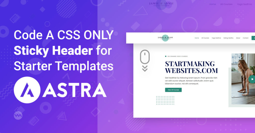
The animation below shows you how our final code will look in action with the free template Online Health Coach from the Astra starter templates:

Hint: You don’t know how to install templates for Astra? We have got you covered with our Tutorial on how to Install Astra Templates.
Now let’s begin. First we will show you how to insert custom CSS Code to WordPress. Then we will show you the code you need to insert.
How to insert custom CSS Code to WordPress
First we need to go to the Customizer in WordPress. To do so you can to your WordPress Dashboard. From within the Dashboard go to Appearance > Customize. Now go to the section that is called Additional CSS.
The Code
Now that we are able to add additional CSS insert the following code
/*
Sticky Navigation for Astra Templates CSS ONLY
©️ STARTMAKINGWEBSITES.COM
*/

/*fix the position of the navigation*/
.main-header-bar {
    position: fixed;
    z-index:9999;
    top: 0;
    width: 100%;
}

/*adjust the padding of the site-content that comes after the navigation*/
.site-content {
    padding-top: 128px;
}

/*adjust site-content for TABLET devices <= 921px (default breakpoints)*/
@media (max-width: 921px) {
    .site-content {
        padding-top: 100px;
    }
}

/*adjust site-content for MOBILE devices <= 544px (default breakpoints)*/
@media (max-width: 544px) {
    .site-content {
        padding-top: 100px;
    }
}
Explanation of the Code
In this section we will briefly discuss the code from above. So you know what’s going on and can adjust the code to your needs.
The first step is to find the existing class that holds the navigation. This class is (for the Online Health Coach Template).main-header-bar.
Hint: You can use your browsers DevTools to inspect the code and search for the needed class. Usually you can access this Tool by clicking F12. Further information:
Chrome
Firefox
Safari
The Basic Concept
Now that we have found the right class, we add some new properties. With the help of these properties we can make the header sticky:
- In order to give the header a fixed position we use the property
position:fixed - To make the header stay on top of every other element we use the
z-indexproperty. Therefore we addz-index:99999 - The navigation position should be on top. So we add the property
top:0 - Lastly we give the navigation a width of 100% to cover the full width that is available.
Hint: Adding the property width:100% to the class has the following reason: When using a fixed position property on an element, the element will loose it’s inherited width. As the navigation has a full width we therefore add a value of 100%.
Mobile Ready – Making things responsive
With the above described basic concept we have almost covered everything already. Hence we have not yet thought about a responsive view of the navigation. This means the nav menu of the Astra Templates (and normally most of the other websites) looks different depending on which device (desktop/tablet or mobile) you are using. Normally there are certain so called CSS breakpoints that basically change the layout of a page depending on the available device width.
Hint: What are CSS breakpoints? CSS breakpoints are certain defined points where a website content responds according to the device width. This is done to show the best possible layout of a website based on the viewing device.
We actually do not have to change the code for the navigation itself. But what we have to change or better to say adjust is the padding of the navigation and the content that is displayed after the navigation. Therefore we adjust the .site-content class when the page is displayed:
- On a device which is equal to or smaller than 921px
@media (max-width: 921px) - On a device which is equal to or smaller than 544px
@media (max-width: 544px)
Here we change the top padding which defines the distance to the navigation bar. We use the value of 100px. These values might change depending on the Theme you are using!
Conclusion
In this article you have learned how to create a navigation that always stays on top. The described solution works best with navbars that are not transparent and have a fixed background color. In case you have a more complex use case, like a transparent header or a changing logo please refer to our more advanced post: How to Create a Sticky Navigation for Astra Starter Templates (with the free Version of Astra). In this post we cover all these issues for you in depth.
As this is only a workaround for a sticky header we recommend you to buy the Pro Version of Astra which comes with a sticky header feature out of the box.
See you next time.


3 thoughts on “Free Sticky Header for Astra Starter Templates with CSS Only”